Why Ford Has Barely Changed Its Logo in a Century
Ford’s iconic Blue Oval became a symbol of reliability by resisting constant redesigns and passing trends.
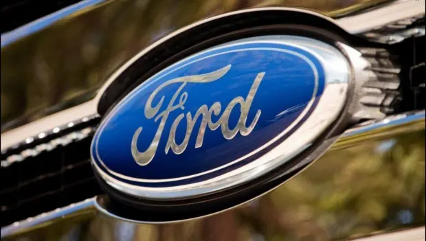
The Blue Oval from Ford remains one of the most recognizable symbols in the automotive world. While many car brands frequently redesign their logos to follow changing trends and digital aesthetics, Ford has spent decades staying remarkably consistent with its visual identity. That decision has helped transform the company’s emblem into a global symbol of reliability and tradition.
In an industry obsessed with reinvention, Ford has taken the opposite approach. Rather than chasing design trends, the automaker has treated its logo as a core part of the brand’s identity — something meant to evolve carefully rather than change dramatically.
The origins of Ford’s branding date back to the early 1900s. The company’s original 1903 logo looked more like an ornate label than a modern automotive badge. But within just a few years, executives realized the company needed a cleaner and more recognizable design.
A major breakthrough came in 1906, when engineer C. Harold Wills created the distinctive script that would eventually define the brand. That handwritten-style font became the foundation of the modern Ford logo.
In 1912, the company experimented with more elaborate branding ideas, including an oval shape combined with a winged triangle meant to symbolize speed. However, Henry Ford reportedly rejected overly theatrical designs in favor of simplicity and practicality.
Interestingly, one of the earliest versions of the now-famous oval logo first appeared within Ford’s British division, where it quickly became associated with durability and affordability.
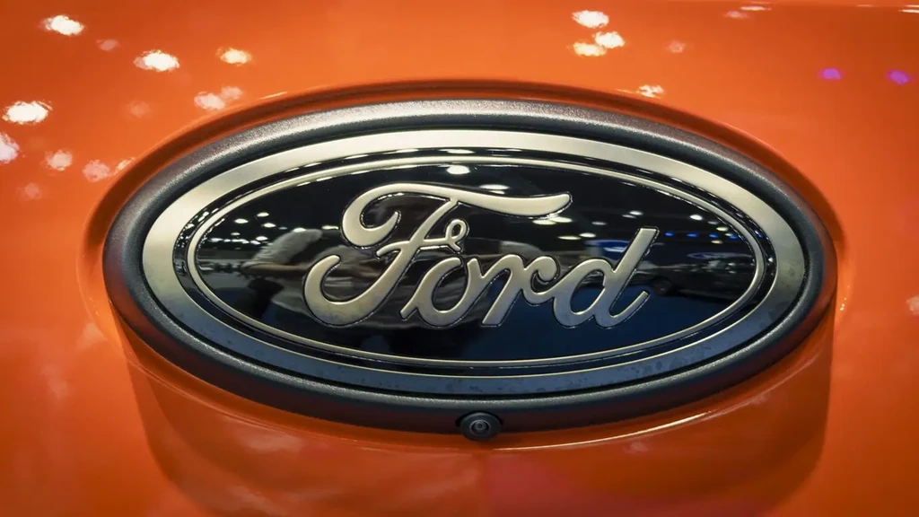
The modern Blue Oval officially took shape in 1927 alongside the launch of the Ford Model A. The combination of white lettering on a deep blue background proved so successful that the company saw little reason for radical redesigns afterward.
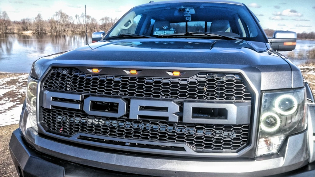
For decades, Ford didn’t even place the oval badge on every model it produced. That changed in 1976, when the company standardized the emblem across its entire lineup and introduced a more dimensional, polished appearance.
During the 1960s, Ford reportedly consulted legendary graphic designer Paul Rand about updating the logo. Ultimately, company leadership decided against major changes, believing the emblem had already become inseparable from the brand itself.
Since then, updates have remained subtle. In 2003, the company introduced a refreshed shade of blue and added more visual depth. In 2024, Ford unveiled a flatter version of the logo for the Ford F-150, but the core design stayed virtually untouched.
At a time when many automakers aggressively redesign their branding to match digital trends, Ford’s restraint stands out. The Blue Oval doesn’t attempt to shock consumers or reinvent itself every decade. Instead, the company has focused on refining a symbol people already trust.
That may be the real reason the logo has survived for more than 100 years. The emblem communicates consistency, familiarity, and dependability without needing explanation. Whether seen on a pickup truck, a family SUV, or a dealership sign, the badge instantly conveys the same message.
Over generations of vehicles, shifting design eras, and countless changes within the automotive industry, Ford has remained committed to one of the most enduring visual identities in the business — proving that sometimes consistency matters more than reinvention.
You may also be interested in the news:
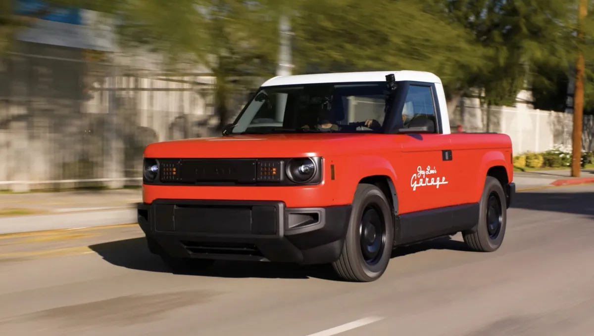
Slate’s New Electric Truck Starts at $25,000, But Most Buyers Will Pay More
Slate’s low-cost electric truck arrives below rivals, though upgrades quickly raise the price.
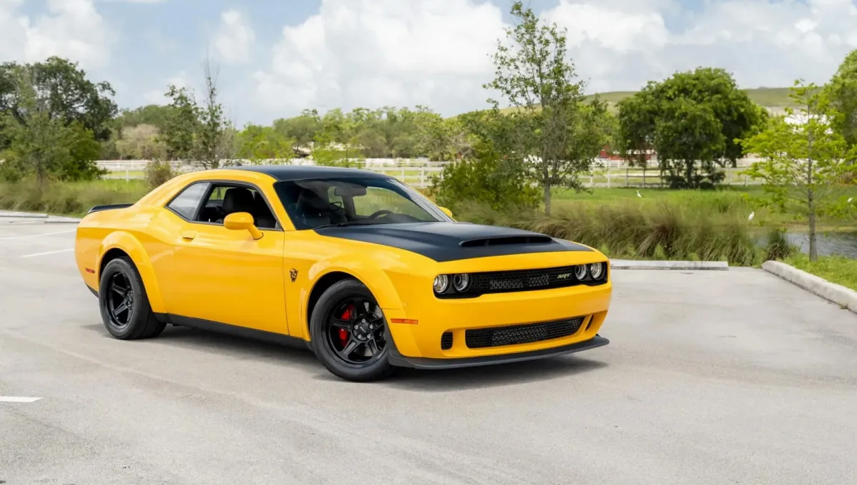
Rare Yellow Jacket Dodge Demon Sells in Florida for $122,000, Far Above Original Sticker Price
A highly optioned Yellow Jacket Dodge Demon with delivery miles just commanded a premium price.

Honda Recalls More Than 880,000 SUVs and Pickups Over Rear Suspension Corrosion Risk
Honda is recalling more than 880,000 vehicles after discovering a corrosion-related suspension safety concern.
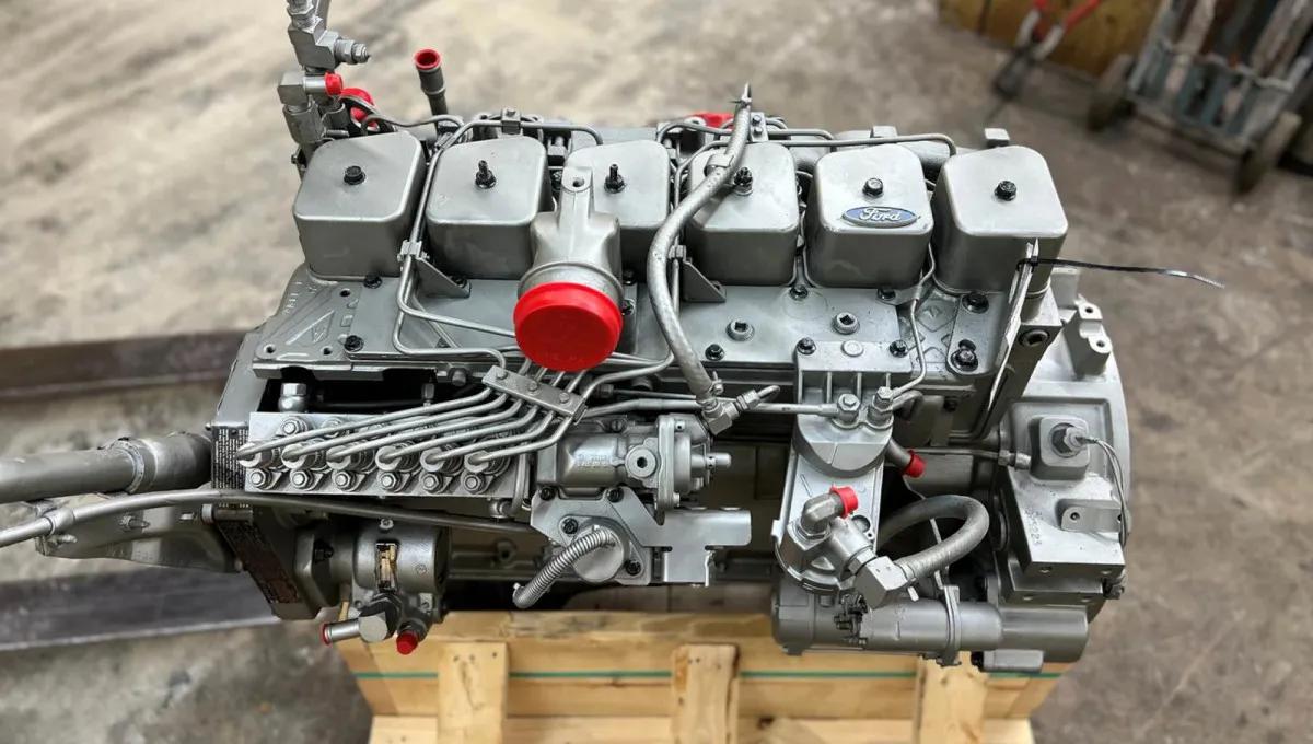
Cummins 6BT: The Legendary American Diesel That Can Run a Million Miles Without a Rebuild
Few diesel engines have earned a reputation for durability quite like the legendary Cummins 6BT.
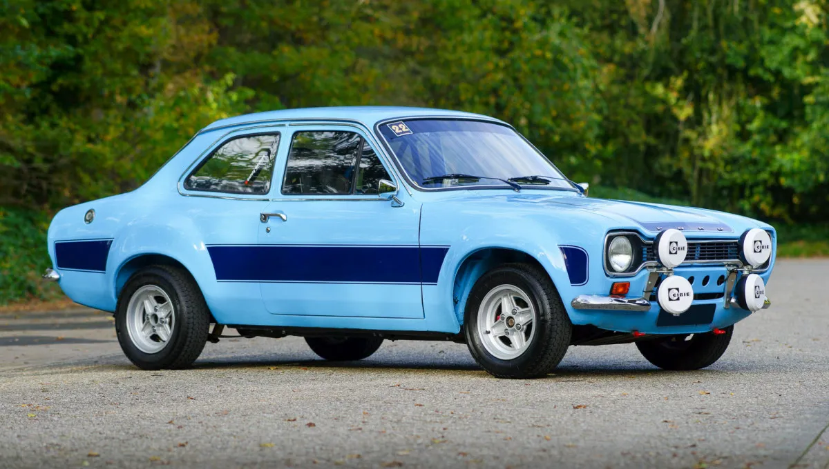
5 Non-American Cars From the 1970s That Are Still in Huge Demand Today
These iconic imports launched decades ago yet remain highly sought after by enthusiasts worldwide.